

Saturday, 22 October 2011
Sunday, 16 October 2011
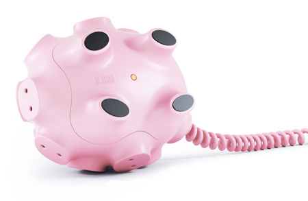
Plug Hub! Oink Oink..
Have you ever thought about how ugly the power strips are? Of course you have... Often white, boring, only for made for practical solutions. Usually they look similar to this:


Horrible! They ruin the interior of your home, probably the reason why they have invented so many 'hiding' solutions for the elictrisity.
Anyway. A few days ago I suddenly found a genius design to that ugly, practical... thing. Watch this!


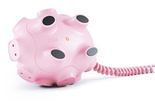
It gives the power strip a new, well designed, humoristic touch and I love it! They even included the pig's tail! So cute.
A pity is that with the three way UK plug it doesn't give the same comparison to a pig's nose, but since I'm from Norway it will work with our system - ha ha!
My only consern is how safe it is, although they do claim it has "(...) built-in circuit breaker that protects from overload."
Well, ok then, I'm having one in the future!
It is designed by Art Lebedev.
Horrible! They ruin the interior of your home, probably the reason why they have invented so many 'hiding' solutions for the elictrisity.
Anyway. A few days ago I suddenly found a genius design to that ugly, practical... thing. Watch this!


It gives the power strip a new, well designed, humoristic touch and I love it! They even included the pig's tail! So cute.
My only consern is how safe it is, although they do claim it has "(...) built-in circuit breaker that protects from overload."
Well, ok then, I'm having one in the future!
It is designed by Art Lebedev.
Idea-a-Week: EAT
Subject for this 'Idea of the week' was 'food'. The answer had to be on a paper bag. This is the result of my idea:
Since I don't have any printer yet it is all hand drawn with copic markers, but I think the result turned out to be quite good anyway.


If you can't read it, it says:
"When you are hungry you get easily
dizzy, irritated, tired, pissed off,
frustrated etc... Wouldn't it be great
to have a watch that tells you when your
"fuel" is running low instead?"
"Running out of time gets a whole new meaning..."
Friday, 14 October 2011
Give a hand to wildlife!
Guido Daniele is an amazing artist from Italy, based in Milan, who has done several artistic work and advertisement of which has become a great international interest. He is most known for his skill of painting realistic subjects, mostly inspired by nature. The interesting fact is that he literally use hands as his canvas! I want to show you a very beautiful and clever advertisement he made for WWF, with the following slogan; "Give a hand to wildlife".


Thursday, 13 October 2011


Wednesday, 12 October 2011
Inspiring, maybe..?

...at least an easy solution. But then again, so much more fun to explore all the other sides as well, not just the left one :)
Sunday, 9 October 2011
WEWOOD!
I LOVE this! The design is so elegant and beautiful, and it has a good philosophy: Everytime you buy a watch they plant a tree. Seem to be morally ambivalent, considering the watches actually are made by trees, but then again they don't use a whole tree to create a watch...


"WEWOOD lets us rediscover nature in its beauty, its simplicity and inspired design. It reminds us of a tree’s powerful way of life; rooted, yet reaching."
"One Timepiece plants one tree, and together we help to ensure the health and survival of the natural world."
"One Watch – One Tree – One Planet"


WEWOOD's own words:
"WEWOOD has
emerged out of Italy as an emblem of eco-luxury
and design, committed to the health of our planet. WEWOOD
is the avant-garde approach
to sophisticated sustainability.""WEWOOD lets us rediscover nature in its beauty, its simplicity and inspired design. It reminds us of a tree’s powerful way of life; rooted, yet reaching."
"One Timepiece plants one tree, and together we help to ensure the health and survival of the natural world."
"One Watch – One Tree – One Planet"


This is going straight on my wish list for Christmas! :)
Friday, 7 October 2011
Li Wei, you are awesome!
Li Wei is a comtemporary artist from Beijing who creates this incredible pictures! His work is a mixture of performance art and photography and he states that his images are not been edited in Photoshop. He make it work with the help of props such as mirror, metal wires, scaffolding and acrobatics. I love the dramatic expression with the humorous tone!


Amazing or what?!
Thursday, 6 October 2011

Sense in design
I think it is an interesting challenge for designers to create something that people normally would experience by seeing, but when we remove this sense we have to think differently on how to approach the "viewer".
This is a good sentence:
"When you are designing something there is a chance you have the luxury of being able to see it, hear it, feel it, or taste it. I know I often forget that having all of these senses is a luxury and that there are millions upon millions of folks who aren’t afforded such things. How will they interact with the stuff that I design? When you start to consider this for even a second you see that your perspective on a design changes just a little bit." - unfortunately I can't find out who wrote it.
This is an example of what I mean, The Rubik's Cube:


"I solved it without even
looking at it once." :)
Amazing art work by Peter Callesen!
I stumbled upon this Danish artist today, but I can not understand why I haven't seen his work before! This is some of the most amazing, creative, handcrafted work I have ever seen! All his work is made entirely out of paper! He cuts out a negative space from a sheet of paper and use that piece to create either a conversation between the negative and the positive space, or to create beautiful shapes out of beautiful patterns. The scale of his work extend from a plain A4-sheet to a whole room installation.
This is a small collection of his work:


I LOVE IT!
This is a small collection of his work:


The scale: 5,3 x 1,3 x 8 m!


This is some of what Peter Callesen says about his own work:
"A large part of my work is made from A4 sheets of paper. It is probably
the most common and consumed media used for carrying information today.
This is why we rarely notice the actual materiality of the A4 paper. By
taking away all the information and starting from scratch using the
blank white A4 paper sheet for my creations, I feel I have found a
material that we are all able to relate to, and at the same time the A4
paper sheet is neutral and open to fill with different meaning. The thin
white paper gives the paper sculptures a frailty that underlines the
tragic and romantic theme of my works."
See more of his work at http://www.petercallesen.com/home/
Wednesday, 5 October 2011
So stupid, so clever, so funny..
Ever wanted a type moustache in Helvetica style? Or maybe you prefere the font Didot or Rosewood? Now it is possible to do it online! No ink, felt pen or coal in your face needed - how amazing!


I prefered the Filosofia. So sexy.
What suits you? Go find out!
Nice video by Alex Schulz
Beautiful, elegant, harmonic, enjoyable... A bit random maybe, with the thing that falls down in the end, but anyway I did actually like this. Basicly fantastic work made by Alex Schulz.
Tuesday, 4 October 2011
Our first group project at Kingston Uni!
Last week we had our first group project at Kingston Uni! In four days we had to come up with an idea to explain and visualise an organ of the body. The organ my group were given was bowels. This is the result:
The resolution of the video at Blogspot is crap, but you can also see it in a better quality HERE.
Created with Tom Manning, Miranda Dixon and Scott Carthy.
Created with Tom Manning, Miranda Dixon and Scott Carthy.
Monday, 3 October 2011
Inkling by Wacom
This is genius! I definitely put this on my wish list for Christmas! Hope Santa comes early this year... :)


Idea-a-week; Extreme Packaging
This is the 2nd week at the uni, and fridays assessment went like this:
"Extreme Packaging - What's never been packaged before?"
My idea:

If I had more time it would be great to create it with a real typeface to make it look more professional!
Subscribe to:
Posts (Atom)