
An interesting project by the multi-disciplinary design consultancy Antrepo.
"Our last project is about simplicity and we try to find alternate simple versions for some package samples of the international brands. We think almost every product needs some review for minimal feeling." - Antrepo


My opinion: Really interesting project where the results actually work very well with most of the products. Some of them I felt were a bit too simplified in the way they loose their identity, but most of them got a much better aesthetic look when they where simplified in stage 1 or 2 (and sometimes in 3 as well).
Hope not the creators of the original designs hate me for this...
Maybe the perfect time to quote Ludwig Meis van der Rohe: "Less is more"
What do you think?
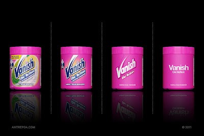
1. Original variation
2. Simple variation
3. More simple variation
4. No logo variation
I have only one bad thing to say about this project, and that is their use of a black background to every picture. It's ok with some of the pictures, but not everyone. It really bugs me...
"Our last project is about simplicity and we try to find alternate simple versions for some package samples of the international brands. We think almost every product needs some review for minimal feeling." - Antrepo


My opinion: Really interesting project where the results actually work very well with most of the products. Some of them I felt were a bit too simplified in the way they loose their identity, but most of them got a much better aesthetic look when they where simplified in stage 1 or 2 (and sometimes in 3 as well).
Hope not the creators of the original designs hate me for this...
Maybe the perfect time to quote Ludwig Meis van der Rohe: "Less is more"
What do you think?
1. Original variation
2. Simple variation
3. More simple variation
4. No logo variation
I have only one bad thing to say about this project, and that is their use of a black background to every picture. It's ok with some of the pictures, but not everyone. It really bugs me...
No comments:
Post a Comment